Note: due to NDA, details and projects I’m allowed to show are limited to what is publicly available and based off industry research. Design decisions based off of internal research, wireframes, iterations, and build kits are restricted American Express intellectual property and cannot be shown.
France eApply Journeys
Design Uplift
— PROJECT NAME
France credit card application uplift
— ROLE
Lead Product Designer
UX Writer
Design Project Manager
— DATE
2022 – 2024
Lead designer for French market overseeing 2 senior designers. Executed and launched a design uplift and a series of features to optimize legacy eApply journeys for 4 credit card products for Air France, American Express, and Amazon.
Collaborated with product, in-house accessibility experts, marketing, user research, design, and engineering.
Accomplishments
Business Unit Key Achievement Award 2023.
+7.5% conversion rate, first optimized mobile experience in any international eApply market. Sole designer.
+2.74% submit rate, drove over ~$30M in business impact from launching new progress tracker design system component in US, FR, UK, MX, AU. Included first ever conclusive A/B test of its kind at Amex (out of 100+ tests). Sole designer.
Commercial pre-fill usage +60% and +50% submit rate compared to manual form. Sole designer.
Developed an enterprise-wide QA process integrating design and engineering, and was selected to present it at the 2024 global internal design conference.
Created new acquisition design system documentation repository for 50 person team Collected internal/external research and analytics to write succinct design usage guidelines for 35+ components. Stood up contribution, governance, and education model.
Mobile Iterations
Desktop Iterations
New Progress Tracker Design System Component
Final Commercial Prefill
Problem
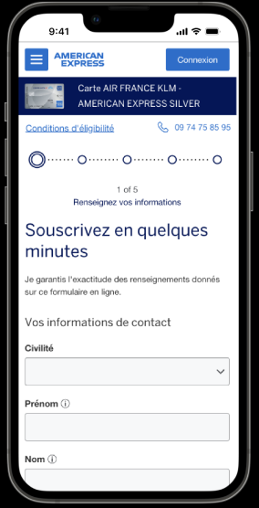
Air France consumer eApply journeys were built on legacy systems that didn’t use the American Express design language system (DLS) and are looking to improve conversion rates.
Considerations:
- A portion of the journey is developed by a third party vendor.
Opportunity
Increase conversion rates by improving:
- Accessibility
- Branding consistency & user trust
- UX/UI and copy
Produce new design system components/patterns
- Form structure + content
- Prefill for commercial cards
- Mobile grouping
- Progress tracker
Create new acquisition design system documentation repository for 50 person team
Develop and pilot a new design QA and tech handoff process to be used enterprise-wide.
The Users
French consumer market:
Debit usage > credit usage in France
Don't have the same central credit system as the US so the application is much longer

Project Steps
- Update designs to Amex design system and team pattern library
- Create new design system components/patterns
- Research + iterate
- Work with French translators to improve all copy
- Tech handoff and Design QA
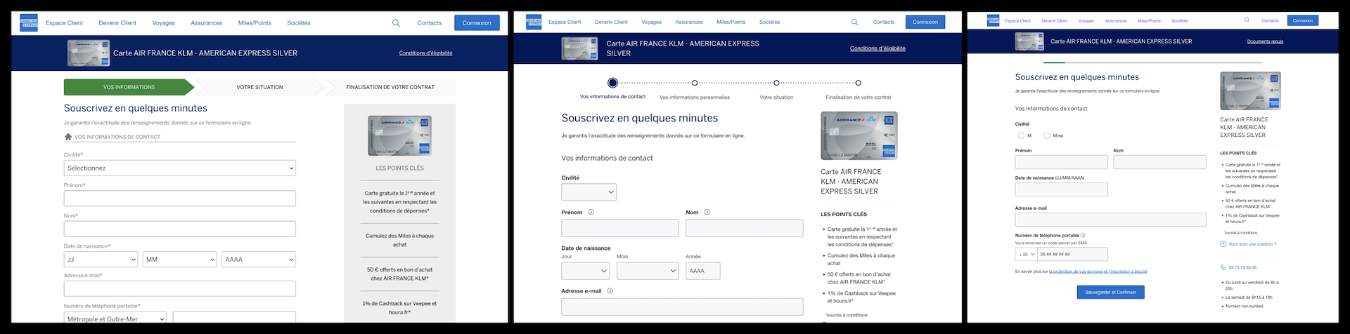
Form Structure
Increased form readability based off of industry best practices, which was added to our design system.
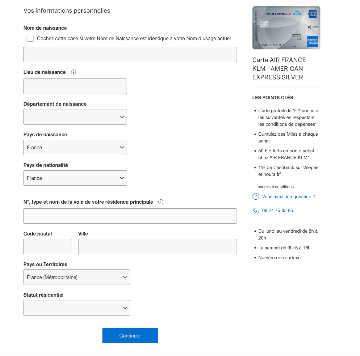
Field Width
A Baymard Institute usability study showed that if the field length doesn’t match the users expectations, then they start to wonder if they misunderstood the label.
By matching field width with the character limits, we give the user a better expectation of how long the input should be while also improving the readability of the form by reducing used space. Too much used space makes it hard for the user to know where to draw their focus to.
Generally, all fields above a character threshold were made full width and otherwise were made half width so they can all align. However, I did have some exceptions here such as zip code and city.
Column Layout
A single column layout with a few select logical groupings like address and first name and last name. If we used too many groupings, it moves more toward a 2 column layout which is difficult to read. Users may go down the entire first column and then the second, go in a zig zag pattern, or read second column and then first. The single column layout is a well researched topic in many industry eye-tracking studies.
Information Hierarchy
Users are more likely to complete a form if it starts out easier. So when there's contact information at the first part of the form, that’s on purpose. If you make progress with the form and you’re more likely to complete it the further you get even if the rest of the questions get progressively harder because you’ve already invested your time. This is called Robert Cialdini’s principle of “commitment and consistency”.
Default Dropdowns
I put the default for several drop downs as France first, as you can see on form structure page since the vast majority of prospective customers live and are born in France, speeding up form completion time. For other drop downs, I made the default blank because if they’re filled in, the user is more likely to miss that they need to complete this field.
Error Messages, Tooltips, Field Labels, & Hint Text
Went through 40+ individual fields and worked with French translators to improve UX and accessibility.
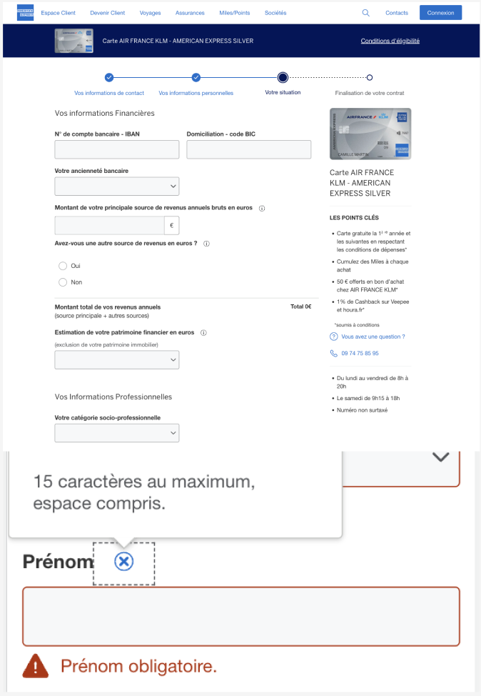
Error Messages
Made accessible error messages that repeat the name of the label name and appear on a component level basis after submit. Repeating the name of the field name along with a message that tells the user how to correct for those with screen readers. Without repeating the name of the field, those who use screen readers won’t know where to navigate to go fix it.
Errors have 2 ways of being perceived in this design: color and written out error message.
Tooltips vs. Hint Text
Hint text was used for any info that is required to complete the input. If it’s supplementary information it goes into the tooltip because not everyone will click on it.
The legacy version had tooltips for every single field that had info that was not useful in many fields, which isn’t the best experience and actually slowed down the time to complete the form.
UX Writing
Made a spreadsheet for all fields with English text, French translations, and suggestions for improvement. This was not only for this product but for all overlapping fields across the market to ensure consistency.
We did not have a copy writer on my team, so I wrote preliminary copy in English or French depending on the complexity and had the french marketing team approve everything. I took 6 years of french so could write some. Writing at a lower reading level is actually good for accessibility. In order to accommodate those with neurological issues, all content should be at an 8th grade reading level maximum (WCAG AAA).
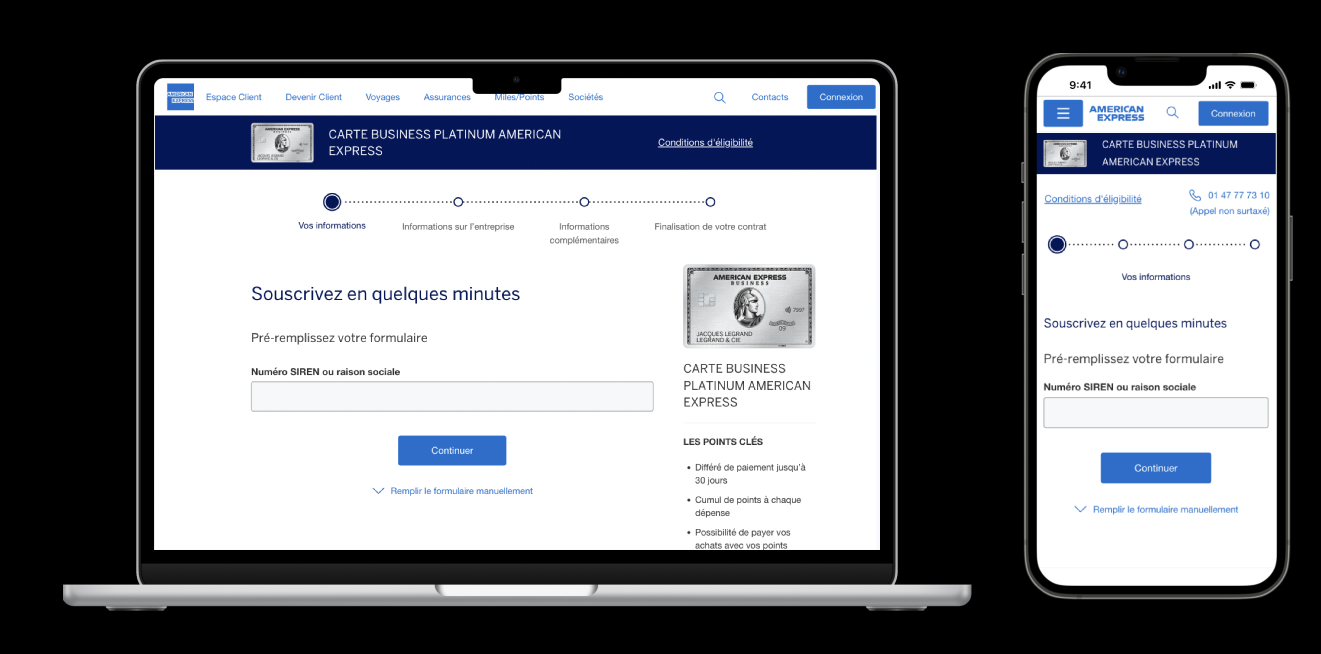
Business Prefill Revision
Commercial card prefill usage increased by over 60%, with a 50% higher submit rate than manual input. I improved the user experience by switching from displaying all fields by default to a hidden format, now allowing users to manually fill out the form as needed.
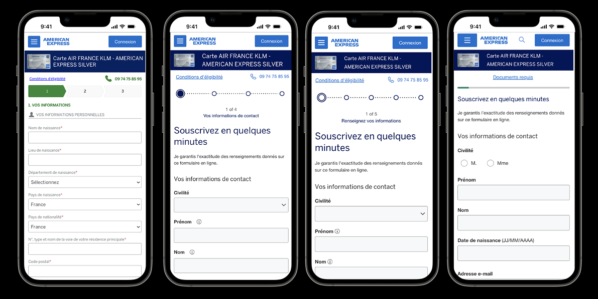
Mobile Grouping
After card sorting and A/B testing for France Consumer, I broke up the pages into more manageable chunks, reduced page scroll, and combined the ID verification journey into the same progress tracker, which led to a +7.5% conversion rate. While I made the journey have more pages, I organized it in a way that the user could orient themselves better in the application and have a better expectation of how long the form would take to complete.
This was based off of guidance from WCAG Multi Page Forms. Breaking up pages into smaller forms "helps make long forms less daunting and easier to understand, particularly for people who are less experienced using computers or who have various cognitive disabilities".
Version 1 (10 pages)
4 steps with a separate tracker for ID verification
Version 2 (14 pages)
5 steps with sub steps including ID verification
New Progress Tracker Component
After pattern audits, gathering industry/internal research, and qualitative studies, I launched a new design system component that has a simplified visual design, a variable speed of progression, and % label. This new style also saves vertical space compared to the old version.
The first conclusive A/B test for any progress tracker at Amex (out of 100+ tests), +2.74% submit rate.
Launched in US, France, UK, Mexico, and Australia, leading to over ~$30M in business value.

Handoff/QA
Created enterprise-wide QA process
- Pixel perfect built kits with implementation instructions
- Prototype walk through
- QA all designs across products and then QA in test environments
Design System Documentation Site
Created new acquisition documentation repository for 50 person team. Collected internal/external research and analytics to write succinct design usage guidelines for 35+ components. Stood up contribution, governance, and education model.
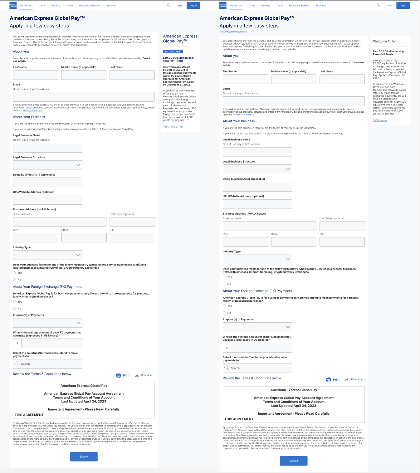
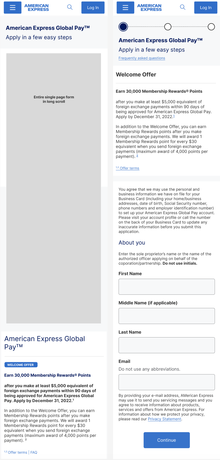
Global Pay Mobile & Offer Optimization
US Market
— PROJECT NAME
Mobile & Offer Optimization
— ROLE
Product Designer
— DATE
2023
Designed and launched an optimized mobile page grouping, a new welcome offer component, and accessible footnotes in desktop/mobile for US Global Pay eApply, which was added to the Acquisition Design Library (ADS).
Collaborated with user research, UX writer, product, legal, accessibility, and engineering.
Note: these designs are public, but not accessible to my specific user group so have been remade on my personal.
Accomplishments
+17% submit rate for mobile page grouping
+5% mobile and +4% desktop submit rate for new welcome offer design system component.
First accessible footnote solution at Amex. Wrote first article for inaugural enterprise-wide design system blog site.
Department Award for Design Impact
Before and After Desktop
Before and After Mobile Page 1
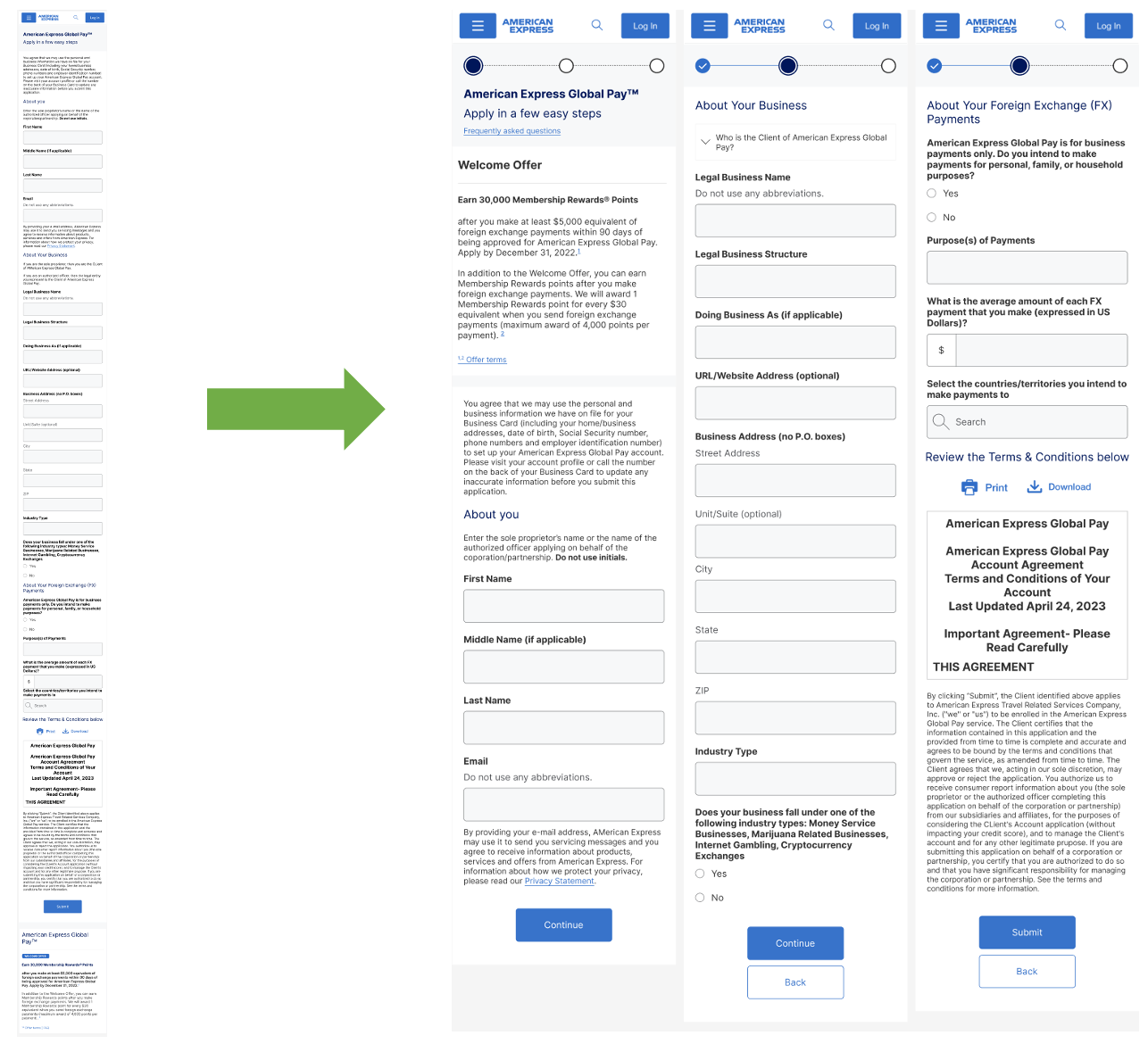
New Mobile Page grouping: 1 to 3 pages
Opportunity
Improve conversion rates by optimizing mobile design. Create new components for right hand rail/welcome offer and accessible footnotes in Acquisition Design Library (ADS).
Hypothesis
Several features leading to potential dropoff
- Single page application with a long scroll
- Welcome offer is at the bottom of long scroll and not seen before dropoff
- Text styling/visual design is confusing
- Copy is cumbersome on mobile
Process
- Pattern audits
- Design iterations
- Prototypes for qual/quant UX research + revised designs
- Low/no vision usability testing
- Pixel perfect build kits
- Tech handoff & QA
User Research
Qual/quant tested several variants distinguished by page grouping, hidden/displayed text, and location of welcome offer.
Pattern Audits
Created detailed audit of American Express patterns for the right hand rail and footnotes documenting screenshots, design observations, and accessibility issues.
Final Welcome Offer
- Welcome offer pushed to the top in mobile to encourage users
- Low technical complexity because of same style in all breakpoints
- Updated visual design/copy to improve readability
- FAQ moved outside the offer because it’s not related to the offer
- Accessible footnotes/links
Footnotes
The accessible footnotes solution in the welcome offer uses numbered superscripts that directly link into the corresponding section in the offer terms modal. Upon exiting out of the modal, focus returns to the original superscript. This satisfies the most critical level (A) from Web Content Accessibility Guidelines (WCAG) in the following sections: 1.1 Text Alternatives, 1.3.1 Information and Relationships, and 1.3.2 Meaningful Sequence.
Low vision testing
Worked with researcher to conduct low/no vision (mix of zoom and screenreader users) usability testing on the improved welcome offer and footnotes, and found that this solution significantly improved the experience for these users.
Mobile Page Grouping
Single page layout moved to a 3 page layout to limit long scroll and break up journey into manageable chunks. +17% conversion rate.
Tech handoff
- Pixel perfect mockups with example grids/spacing
- Prototype walk through during engineering grooming
- Slack channel with engineers/product
- Design QA
- Using my frontend experience to answer questions and debug
Results
New welcome offer led to a +5% on mobile and +4% on desktop conversion rate. +17% submit rate for new mobile grouping.
Enterprise Doc upload Widget
— PROJECT NAME
Doc Upload Widget
— ROLE
Lead Product Designer
Accessibility Auditor
— DATE
2023 – 2025
Lead product designer for enterprise widgets, overseeing 1 senior designer. Shipped the first configurable enterprise document-upload widget featuring a scalable UI layer for journey-level customization. Conducted full accessibility audit and remediation, optimized mobile UX, and resolved key pain points that caused up to 40% drop-off.
Scale of Widget (100k users/mo.)
- 16+ markets
- B2B, B2C, and internal colleagues
- New customer acquisition decisioning
- Line increase decisioning
- Pay-over-time decisioning
- Customer appeals
Launched journey UI + widget in Canada eApply. Released both to all teams at Amex.
Note: these designs are public, but not accessible to my specific user group so have been remade on my personal.
Problem
The legacy widget tightly coupled the doc upload component with journey UI logic, making any change risky for all consumers. It also had numerous accessibility issues, contributed to up to a 40% drop-off, and suffered especially low submit rates on mobile.
Opportunity
Build two scalable solutions: a configurable enterprise doc upload widget and a customizable journey UI.
This optimized approach ensures consistency, improved accessibility, and reduced drop-off—especially on mobile. Decoupling the journey UI empowers teams to customize experiences, run independent A/B tests, and accelerate delivery without relying on platform prioritization.
Process
- Analyzed drop-off and submit rate data
- Iterated on solutions with stakeholders based on insights
- Ran usability studies
- Facilitated feedback workshops across the enterprise
- Conducted accessibility audit
- Led tech handoff and design QA
Legacy Widget/UI Critique
- Accordions cause page shifts, especially on mobile with many categories.
- Confusing attach-upload-submit flow; no edit after upload.
- File uploader shows no clear progress
- No file preview
- Only one file upload at a time
- High cognitive load from excessive content per page.
- No drag/drop file upload functionality
Solution 1: Stand Alone
Created a configurable doc upload component that works for both single and multi file upload.
- Drag/Drop (desktop) or click to upload
- Disappearing upload area once finished
- Loading progress bar
- File preview link opens in new tab
- Merged attach & submit functionality into 1
- Made file size visible
Desktop error
Drag and drop only possible in desktop.

Mobile error
Switches to a button for mobile.

Bulk File Upload Final
Upload more than 1 file at a time. Only remove the upload area once requirements for the question have been met.

Solution 2: Journey Template
Created an overlaying interaction pattern for how to handle complex and/or high # of doc uploads
- Tiles + modal solution reduces cognitive load and improves usability especially in mobile
- Page content, number of tiles and inside modal is fully customizable to include any # of file upload areas or text
- Custom tile with review state are new components for acquisition design system

Accidental deletion prevention, fully upload notification, and accidental cancel prevention
Canada use case
Used new journey UI template + widget in Canada credit card prospect eApply form. This doc upload feature is used to help decision potential customers who receive a pended application. I consulted for the local market design team, who implemented my solution.
Canada Widget + Journey UI Final Implementation
Canada Mobile View Final
Drag and drop area converts to a button in mobile. Main CTA’s turn fluid.

Tech Handoff & Design QA
Created an extensive build kit with detailed annotations for interaction, accessibility, and development. Did a build kit/prototype walk through and then conducted design QA using the browser inspect tool on the test environment.
Accessibility Audit
Conducted a full WCAG 2.2 accessibility audit including automated, guided, and manual testing methods using the Deque Axe plugin. Documented and recommended 40+ solutions to engineers.
Results
Launched journey UI in Canada eApply. Released widget and journey template + documentation to all teams at Amex. Resolved key pain points in legacy widget that caused up to 40% drop-off.
Full results pending :)
Hilton.com Card Shop
Consumer and Commercial
— PROJECT NAME
Hilton Card Shop
— ROLE
Product Designer
— DATE
2025
As sole designer, launched modernized consumer and commercial Hilton.com Amex card shopping experiences. Introduced a new hero image style, improved accessibility/UX/UI, and reduced technical overhead through migration to Amex component libraries.
Worked with 2 product/engineering teams, Hilton marketing, and legal.
Final Consumer Desktop Card 1
Final Consumer Mobile Card 1
Problem
The project began as a small effort for commercial cards to replicate a legacy consumer experience outside Amex’s design system. Rebuilding it from scratch was time-consuming and hard to scale, with critical accessibility issues (color contrast, heading structure) and low mobile conversion.
Opportunity
Remediate accessibility issues, improve conversion rates, create a new hero image editing style, and improve maintainability/branding consistency by leveraging Amex's existing component library to create unified, scalable experiences.
Process
- Uplift components to Amex library
- Redesign hero image style to fix color contrast issues
- Optimize mobile
- Build Kit, Tech Handoff, and Design QA
New Hero Image Style
In desktop, created an image background with a custom gradient application and color selection picked from the image to resolve the color contrast issue with the title/annual fee. Each of the 4 cards have different imagery/gradient colors.
In mobile, created a custom solid blue -> sand color gradient with no image to replicate the feel of the beach from the image. All cards have the same gradient in mobile breakpoint.
Mobile optimization
Previously, the all benefits section was fully laid out in a grid format with a very long scroll. Upgraded to collapsed accordions that expand in desktop and accordion buttons that open a modal in mobile. By using progressive disclosure and limited scroll, I reduced cognitive load.
With the majority of benefits behind a hidden disclosure, I pulled out a handful that were in the accordions in a new section called featured benefits. This was to entice users, without overwhelming them compared to showing all benefits at once.
Included a second Apply now CTA toward the bottom of the page to limit scroll fatigue if a user reads through the benefits before deciding to apply.
Results
Pending :)
Internal LLM Financial Tool
— ROLE
Product Designer
UX Researcher
Product Manager
Scrum Master
— DATE
2021 – 2022
Sole designer, researcher, and product manager for the launch of a global internal LLM financial tool.
Accomplishments
Increased analyst productivity an estimated 66x
MVP launch and 2 feature releases
Process
- Qualitative user research with internal users
- Affinity Diagramming
- Feature prioritization
- Low – high fidelity mockups with usability testing/revision
- Tech handoff and QA
- Led engineering daily standup, PI/sprint planning
Qualitative UX Research
Created protocol and interviewed Amex employees
- Affinity Diagramming
- Feature brainstorming & prioritization
For the qualitative UX research study, I created protocol and interviewed amex employees. I explored their current work process and issues they faced. After the interviews, I did affinity diagramming to map out responses and organize into themes. Then I did feature brainstorming and prioritization.
Some things I considered when developing interview questions were:
- Not asking leading questions, or in other words trying to be neutral. So instead of asking what do you like about this page? You ask what do you think about this page?
- Asking questions in an increasing order of difficulty. Similar to how I did form design in the previous project, start off with easy questions and then people will be more invested to finish as they go through.
- Limiting question-order bias
Low – High Fi Mocks
Low – high fidelity mocks and had feedback sessions from stakeholders and the engineering team at each stage.
Usability Testing
I did moderated remote usability testing with Amex Employees. These were task oriented with follow up questions around: emotional impression, their opinions, user satisfaction, and any recommendations for how to improve the app.